

Visualization is an increasingly important skill that we are seeing in demand and businesses often notice the lack thereof, too. Data visualization can help you communicate complex messages and get your point across, but if you’re doing it wrong, all you are doing is confusing your audience. Here is a guide on how to use Google Data Studio in a way that is both helpful and effective.
Data visualization is one of the most important skills for a data driven marketer. However, creating the most effective data visualization is not an easy task. With Google’s Data Studio and other tools like Tableau and PowerBI, you can make beautiful data visualizations. Let’s look at how Data Studio works and how to best use it for a complete visualization service.
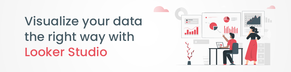
Looker Studio – The Google data visualization tool for you
Data Studio, also known as Looker Studio, is a web-based data visualization and reporting tool from Google. The tool lets users to research from documentation or you can use “data sources” to list out all possible data sources. It also lets users connect to various data sources (like Google Analytics, Google AdWords, Google Sheets, DoubleClick, etc.) and create interactive visualizations and dashboards. Data Studio is often used by SEOs to create SEO dashboards that can be used to track the performance of SEO campaigns. The tool is a new and easy way to create visual reports. You can create a report with multiple charts, maps and tables and share it with others. It also helps you to connect to 800+ data sources and can connect to data from Google Analytics, AdWords and Google Sheets. You can create an unlimited number of dashboards and share them with other users.
Why leverage Google Data Studio
Visualizing data is one of the best ways to make your message and voice heard. People who see data in a visual format react to it differently than anyone else. They also retain the information longer and are more likely to take action after seeing the data. Data Studio can be divided into two categories: paid and free.
Data Studio/Looker Studio is one of the most used tools by marketers. It makes it easier for them to create reports and analytics without spending a lot of time on building interactive charts, graphs, and dashboards. It is a cloud-based data visualization and reporting tool developed by Google. It allows you to create reports, visualizations, dashboards, and data-driven pages in an easy and hassle-free manner. If your business needs dashboards that can get as real-time as 30 minutes of latency/delay, you can use data studio with its free version.
Another impressive feature of the tool is the Google Data Studio API. It allows Google Workspace or Cloud Identity organizations to automate management and migration of Looker Studio assets. You can configure an application to use the Looker Studio API quickly and easily. The feature allows you to search for and manage Looker Studio assets.
With Data studio, businesses can now –
- Visualize and share impactful business stories by creating and sharing engaging reports and data visualizations.
- Unite data by easily connecting to more than 800 data sources, and transform it into impactful business metrics and dimensions with intuitive smart reports.
- Empower your teams with key business metrics by sharing automated dashboards.
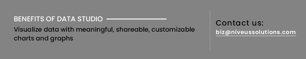
- Create meaningful, shareable, customizable charts and graphs.
Data Studio – How it works – Case studies
Here’s a look at how some of our customers are benefiting from data visualization with Data Studio –
- A multi-billion dollar conglomerate, with the implementation of Looker Studio, provided all business users with access to all required information from different sources in a single place for real-time analysis
- A top non banking financial company worked with Niveus to consolidate their loans and billing information for all their accounts, and made the data available in real-time
- India’s oldest music label now brings data from multiple data sources, for analyzing information and generating insightful reports via a data warehouse implementation with Looker
- A leading automobile player is leveraging Data Studio for analysis on aggregated data for each vehicle, a scalable API layer with monitoring and easy integration, and real time information such as trip details and vehicle health.
Common dashboard mistakes and best practices
Many users have come up with some common dashboard issues and mistakes that they have encountered. The dashboard mistakes are typically related issues that are caused by user behavior or dashboard settings. Here are the issues that we have noticed and the best practices to solve them.
Having a Dashboard – Businesses often assume that a single technical report is enough to keep a track of their operations and data. Businesses have to move away from canned reports (centralized documents, created only for top management) to Ad hoc reports (for all employee categories, including external stakeholders such as customers.). Nowadays, 100 page technical reports are being replaced by dashboards, as data scientists know better. Dashboards may seem like extras, but they are actually essential.
Best practice: Using GCP Data Studio/Looker Studio helps businesses in maintaining a dashboard that is both timely, up-to-date and precise.
Creating Multiple Dashboards – As data scientists garner the benefits of a dashboard project, the need for multiple dashboards has also been identified. In the past, businesses would make a single dashboard and run their data through it. All the information was crammed in.
Best practice: Maintaining multiple dashboards helps to streamline information and not overcrowd visualizers.
Overdoing Interactivity – All the cool things that interactive dashboards can do, like adding drop-down menus or checkboxes, can make reports very attractive. Interactivity lets the user explore the data further. However, it can be distracting if not done prudently. Using less interactive and more static dashboards for the high-level executives who don’t have extra time to explore data, or, for the non-technical audiences who just want the key takeaways, would be more helpful than a highly interactive business dashboard.
Best practice: Use a blend of static and dynamic dashboards with respect to the audience requirements
Maintaining space and readability – A common misconception is that a dashboard has to fit onto a single screen or page for a once-glance understanding. That’s not necessarily true. Cramming all the information into one page, actually has detrimental effects on data comprehension. Using multiple pages, with sufficient spaces between graphs and text boxes would help your dashboard.
Best practice: Give the dashboard some room to breathe so your audience doesn’t feel overwhelmed by the sheer density of the data.
Showing older data and progression – One of the most common mistakes is only showing the latest data. If dashboards include only current data, audiences would miss out on important details from data earlier. Flipping between the previous month’s dashboard to the current numbers, in order to make comparisons. By showing the older data, data scientists allow viewers to see the bigger picture.
Best practice: Using line graphs can help viewers see whether there are fluctuations over time.
Data Studio Pro: Pricing
While Data studio comes with a basic free version, Data Studio Pro makes it easy to manage access to your reports and data source at scale. The Pro version also comes with two new features: team workspaces and Google Cloud project linking. With the enterprise-friendly Pro version, businesses can get improved asset management, new team collaboration capabilities, and access to technical support from Google.
For more information, including pricing plans, get in touch with us at biz@niveussolutions.com